Color Theory for Miniature Painters
A Guide for Every Painter and Color Enthusiast
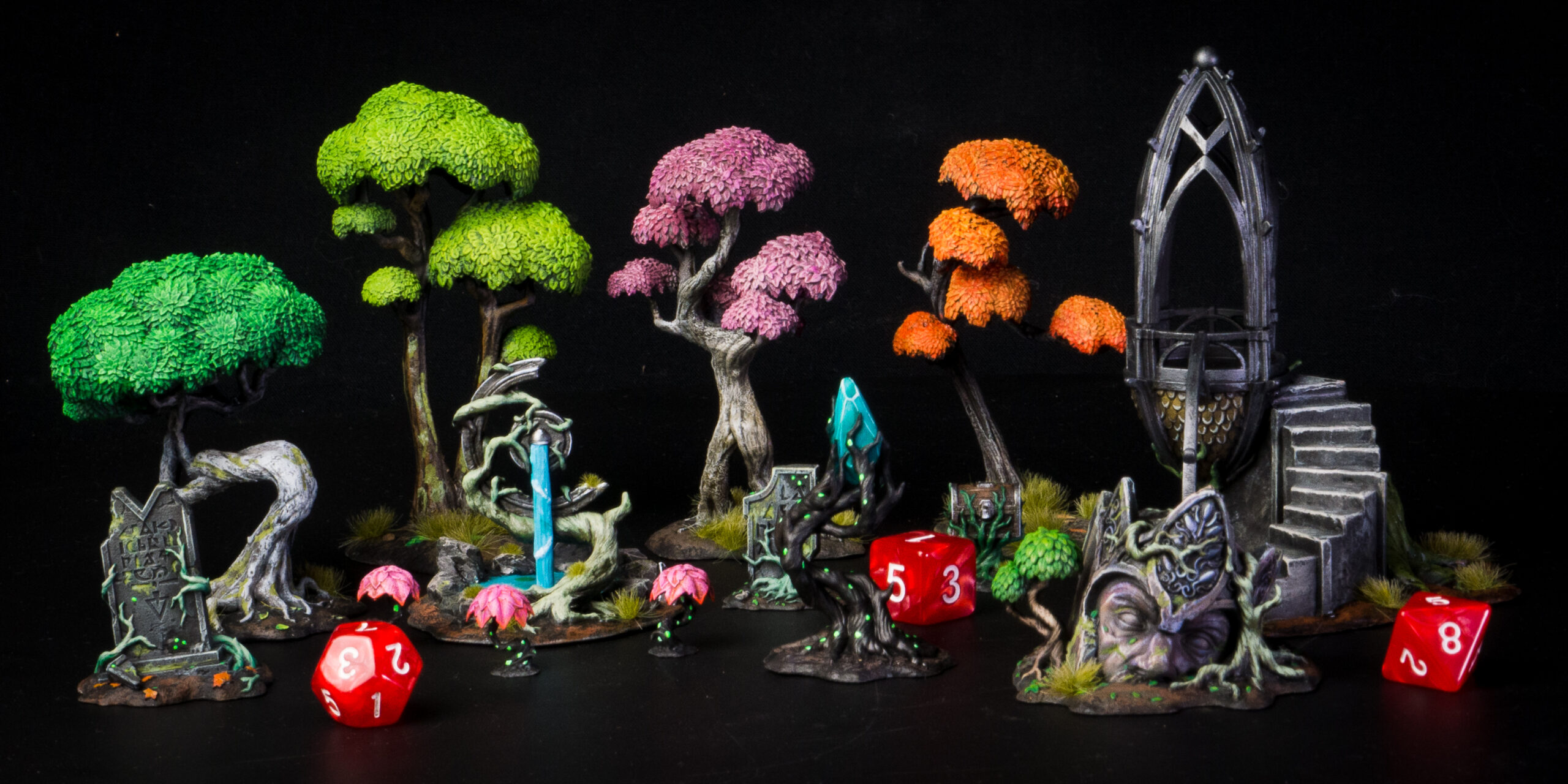
Calling out for tabletop gamers, collectors, artists, hobbyists, or you! Yes, you, mini enthusiast! If you’re a fan of miniatures, you’re already part of an exciting hobby. If you don’t have any minis yet, check out 10 reasons to start your collection. In any case, have you considered taking your collection to the next level by adding a personal touch with the help of color theory?
Painting your miniatures can be a gratifying experience. If you are already an artist, you don’t need any convincing on that note, but you’d be thrilled to read about some painting hacks on how to do an even more appealing job with color, right?
Color theory studies how colors interact and how the human eye perceives them. It’s all about working with them in a way that reminds us of making a recipe of yummy colors, creating a new world of possibilities and perceptions.
Principles such as the color wheel, color harmony, and color psychology make us understand things better when painting or even admiring an artist’s work. It can help designers, artists, and anyone interested in creating or seeing visually pleasing minis.
So let’s start with the basics, then. Yes, color adventurers, color theory!
Red, Blue, and Yellow, aka the Building Blocks of Color Theory
Red, blue, and yellow are known as the building blocks of all other colors because when at least two of them are mixed, a new color is created. For example, red and yellow together form orange; with blue and yellow, you get green; finally, purple is what you have when red and blue come together.
New Colors Are Beautiful When the Color Wheel Goes Round and Round
What is a color wheel? Well, it’s like a big circle with all the colors on it, and it exists to help us figure out which of them look good when put together.
There are three different types of colors on the color wheel: primary, the “building blocks” we talked about: red, blue, and yellow; secondary, which are the mixes of two of the primary colors – orange, green, and purple; and tertiary, also known as intermediate colors, due to their compound nature: blue-green, blue-violet, red-orange, red-violet, yellow-orange, and yellow-green are color combinations you can make from color mixing.
The Architecture of Color: Color Schemes or Color Harmony
There are different ways of using colors together, whether from other sections of the color wheel or not. To make something look cool, you can follow a few schemes to understand what goes with what is better:
- Complementary colors: colors that are opposites on the color wheel. They make each other stand out like red and green put together;
- Analogous colors: the ones next to the other on the color wheel, such as blue, green, and yellow. They make a pleasant and harmonious scheme when seen alongside;
- Triadic colors: using three colors evenly spaced from one another on the color wheel, creating a balanced look. To make this scheme, start by choosing three colors. Then, find two colors directly opposite the first color. So, red, green, and blue would be your triadic color scheme;
- Monochromatic colors: this scheme may sound simple; however, they can create a cool color scheme, presenting different shades and gradients of the same color. Imagine, for instance, a blue palette with light, medium, and dark blue dividing the same space.
And how do you pick from those different possibilities? Well, it’s about deciding what will make your dreams come to life!
To illustrate, imagine you’re trying to create a forest atmosphere with multiple pieces representing nature and forest beings. Triadic color schemes can be a great way to add variety and interest to your artwork, balancing colors, so they don’t overwhelm each other. For instance, you can use one dominant and the other two as accents. Triadic schemes are about exploring colors and adding depth and dynamics to your work.
On the other hand, imagining an army of villains could be an exciting way to explore monochromatic colors with different skin colors (there’s a post about perfecting skins here). You can create a sense of mystery and foreboding using cool colors like blues and purples. You can change a narrative by presenting even more than fifty shades of grey, black, white, or another chosen color and all of its universe.
Feelings, Nothing More Than Feelings: Color Psychology
In this topic, many specialists would pour their hearts and souls out, but not just that: color theory and how they make us feel are an object of multilateral study.
Color psychology explores how colors interact and can affect human emotions and behavior. Understanding this can be helpful in marketing, advertising, branding, and many other fields, but especially in our case, it can affect how we perceive atmospheres and characters.
Blue is often associated with sadness. Other cool colors like green, gray, and purple are associated with calmness and trust. Warm colors like red can evoke feelings of excitement or danger.
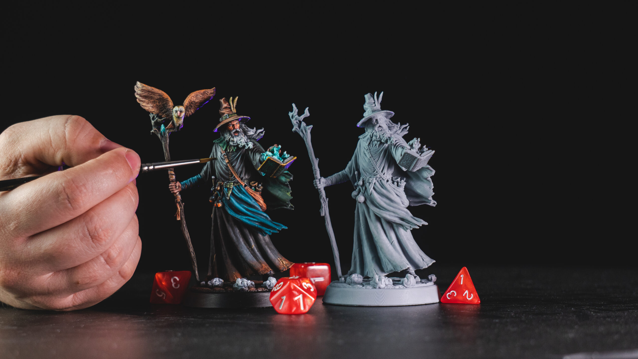
Now that we have covered the basics of color theory, we’ll dive into some painting hacks and what color has to do with all that. These tips and tricks will help you create beautiful, vibrant paintings for minis that stand out from the crowd, taking them to the next level, no matter if you’re a beginner or an experienced mini painter.
So, let’s explore some ways to incorporate color into your miniature painting process!
#1. Roses Are Red, and Violets Are Blue. Color Theory, We Love You!
We all have moments where we struggle to come up with new ideas or creative solutions. Using color theory, you can overcome these moments and develop fresh ideas by experimenting with different color combinations and seeing what works best for your miniature. You might be surprised at the results!
To overcome these deathly holes in creativity or imagination, try this:
- Use the color wheel to determine which colors work well together;
- Experiment with different levels of saturation and value to create depth and contrast;
- Use color to highlight specific areas of your miniature, such as weapons or armor;
- Don’t be afraid to mix colors to create new shades and hues;
- Consider the lighting conditions in which your model will be displayed, which can affect how colors appear.
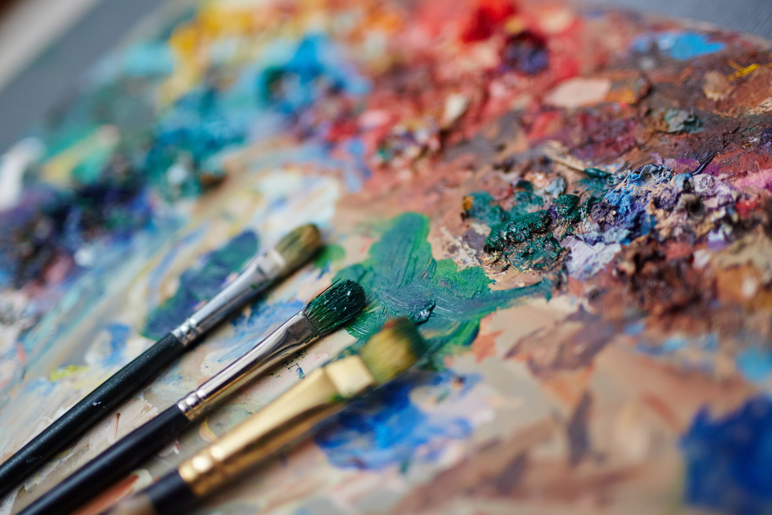
#2. Wet, Wet, Wet – The Palette You Need!
This palette has a layer of water under a piece of absorbent paper or cloth. By keeping your paints wet, you can easily mix and blend colors as you paint. This helps to create smoother transitions between colors and allows you to make more subtle variations in hue and tone.
#3. Thin Your Paints, Adventurer!
Thin your paints with water or a medium to create a more even and smooth layer of paint, allowing the details of the miniature to show through and help you to avoid a chalky or grainy appearance. It can also help to create smoother blends between colors.
#4. Use Contrast, Glazes, and Washes to Create Deapth – and More
Using contrast when painting minis means using light and dark colors to create highlights and shadows. By layering light colors over dark colors, you create a sense of depth and dimensionality that makes your miniature look more realistic.
Glazes and washes are thin, translucent layers of paint. But glazes add color and depth, while washes add depth and shadow to your mini.
Glazes can create subtle variations in color, add a tint or hue to a base coat of paint, or make a glazed or iridescent appearance. They are great for creating gradients, where one color blends smoothly into another.
Finally, washes create subtle shading to darken recessed areas, or they have a weathered or aged appearance. Apply washes over a base coat of paint to make a more realistic and dimensional appearance.

#5. Use a Dry Brush Today, and Create the Best-looking Mini Tomorrow
Dry brushing is a technique where you apply a small amount of paint to a dry brush and then drag it lightly over a surface, creating a subtle, textured effect mainly used to create highlights and weathering effects on your miniature. It’s especially effective on textured surfaces like fur, hair, or rock formations. If that werewolf is too challenging to look perfect, try this out now! You can also use this technique to create realistic metal, such as armor and weapons!
Choosing your brush wisely is one of the best pieces of advice ever given!
Experimenting with different techniques and getting to know more about paint takes practice, for sure! After a while, you’ll be able to create stunning and lifelike miniatures that impress the most talented artists.
There’s always something new to learn and discover in this hobby, and joining a community on the subject or even watching videos online could be a good company throughout the process of bringing a tiny 28mm figure to life with a few brushstrokes. Come aboard right now, adventurer, and be welcome to the exciting and endless creative world of miniature painting!
Loot Studios can help you paint highly detailed minis, statues and props. Choose your favorite bundle from our previous releases or sign up for Fantasy or Sci-Fi to receive a new bundle every month. You can also check out some tips at our YouTube Channel.